Example
Below is an example of a basic card with mixed content.

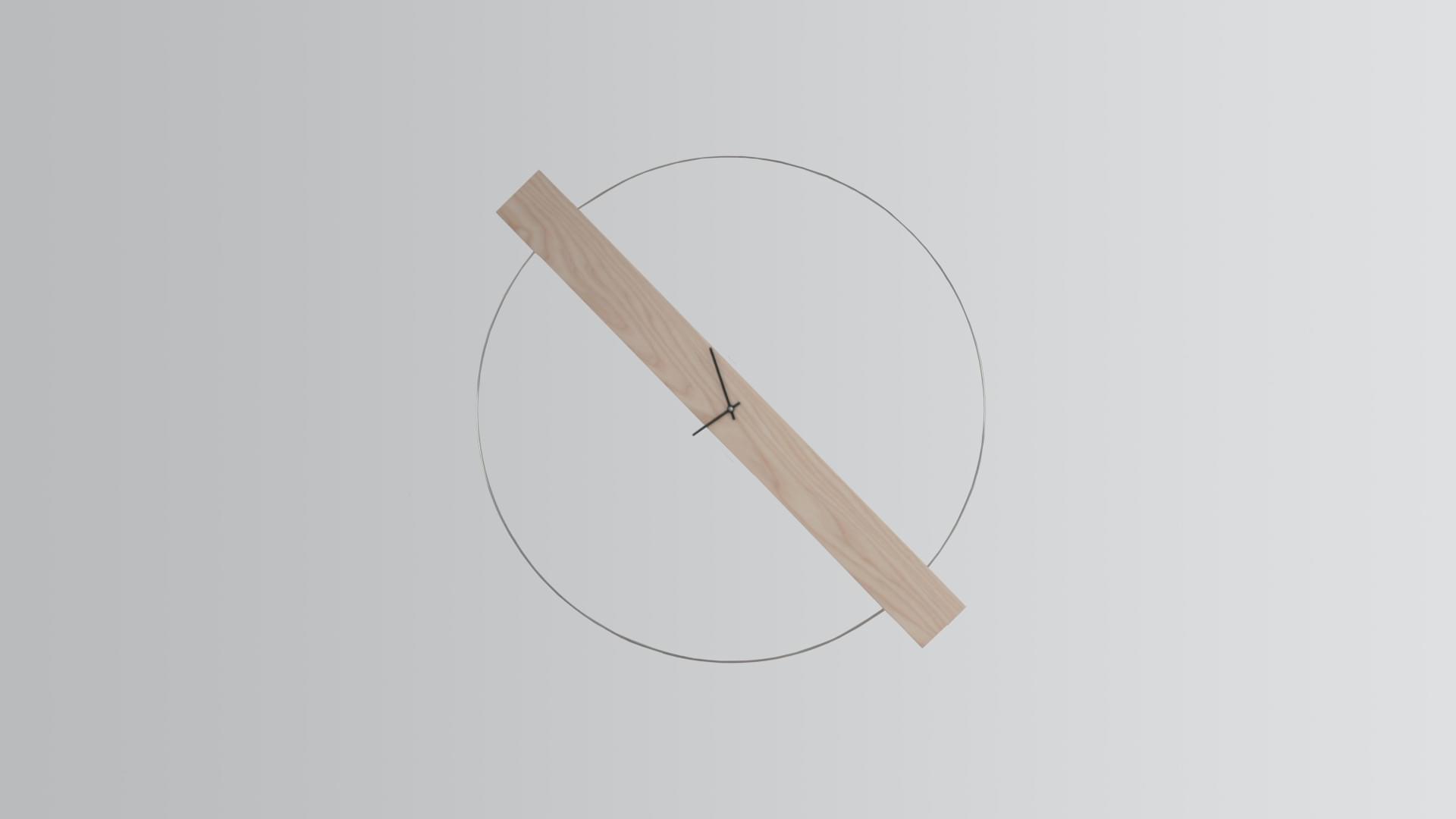
Interesting Time Facts
April 28, 2021
Yesterday’s the past, tomorrow’s the future, but today is a gift. That’s why it’s called the present.
Read moreHeader and footer
Add an optional header and/or footer within a card.
Strive for greatness.
Interesting Time Facts
Yesterday’s the past, tomorrow’s the future, but today is a gift. That’s why it’s called the present.
Read moreNavigation
Add some navigation to a card’s header.
In a professional context it often happens that private or corporate clients corder a publication to be made and presented with the actual content still not being ready.
Image caps
Similar to headers and footers, cards can include top and bottom “image caps”—images at the top or bottom of a card.

Card title
This is a wider card with supporting text below as a natural lead-in to additional content. This content is a little bit longer.
Last updated 3 mins ago
Card title
This is a wider card with supporting text below as a natural lead-in to additional content. This content is a little bit longer.
Last updated 3 mins ago

Image overlays
Turn an image into a card background and overlay your card’s text.

Groups
Use card groups to render cards as a single, attached element with equal width and height columns.
This is a wider card with supporting text below as a natural lead-in to additional content. This content is a little bit longer.
Last updated 3 mins ago
This card has supporting text below as a natural lead-in to additional content.
Last updated 3 mins ago
This is a wider card with supporting text below as a natural lead-in to additional content. This card has even longer content than the first to show that equal height action.
Last updated 3 mins ago